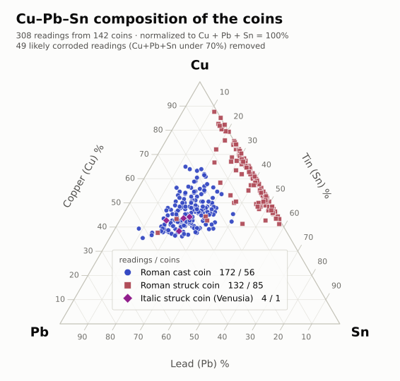
All the of the images below have been shown in at least one public talk, most recently for colleagues at Peking University, so I feel it is high time I share them more broadly. All were drawn from my own data using Claude.
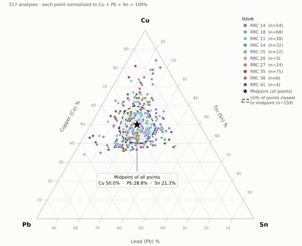
Surface readings do not give the original recipe but in aggregate they do provide a pattern.
This image shows the lack of distinction between issues. There are no meaningful color groupings.
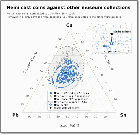
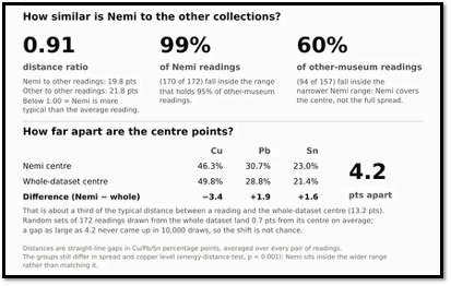
This image shows that artifacts from a single find spot are more cohesive as we would expect. Those in other collections tend to have more copper I believe because of more intensive cleaning and even re-patination. Nevertheless I take comfort in the broad overlap. I showed a different visual of this overlap earlier on the blog, but I like this one better as it comes with measurements of difference.
I took readings of every bronze from Nemi in Nottingham. Multiple readings. Some of this I’m hoping back for publication but this one is interesting as it shows how different the struck coinage surfaces remain is even when in the same conditions of deposition for two millenia. I also shared this earlier on the blog but wanted it here to have the collection of data visualizations in one place.