RRC 111/1, Central Italy (?) circa 211-208, AR 4.03 g. NAC 61 (5/10/11), lot. 498.RRC 126/1;uncertain mint circa 206-200, AR 4.56 g. NAC 61 (5/10/11) lot 571
I enjoy how these two coins together illustrate the variety of acceptable forms of the letter A in the Latin alphabet at the end of the third century. That on each specimen two very different forms of the same letter co-exist warns the epigrapher against using these letter forms alone as a dating criteria. It also suggests to me that certain names were rendered in particular ways habitually. Compare for instance the VAR ligature of RRC 126/1 with that C.VAR ligature of RRC 74/1 (links to BM specimen). ROMA has an open single bar A because that’s just how the word looks right.
RRC 316/1. ANS 1937.158.34 Obverse: I·S·M·R – Head of Juno Sospita right, wearing goat-skin. Border of dots.
I was thinking about the use of legends on the republican series to label or describe the images. The above type is a nice example of the use of abbreviation to do so. We can resolve it based on longer inscriptions in other contexts.
CIL I2 1430 cf. I2 p. 987 = XIII 1030* = XIV 2090 = ILS 3097 = ILLRP 170 = Suppl. It. – Latium vetus 1, 72
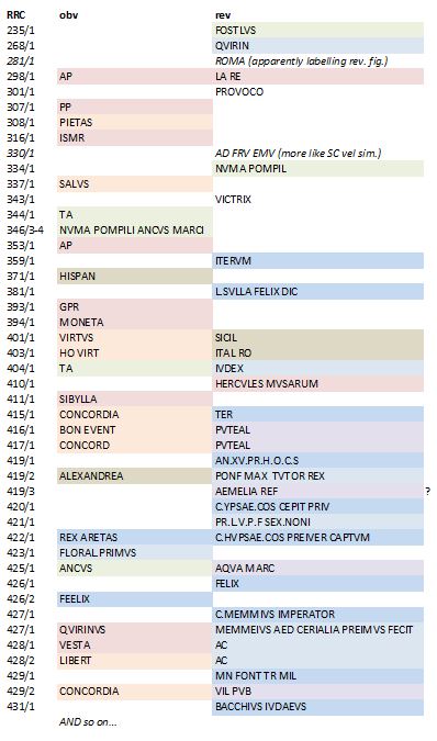
I wanted to think about the phenomenon over time and by type of usage. So I created a little color coded chart. No promises I didn’t miss a few or mis-transcribe a couple, I didn’t want to give this too much time.
My groupings are pretty subjective, pink for hard to recognize gods, peach for divine qualities/virtues — aren’t those two pretty much the same thing? Green for Kings, but then I threw in Faustulus because where else would he belong in these categories? Blue for the accomplishments of individuals. This can be hard to separate from the moneyer’s name and titular. A slightly darker blue for military accomplishments and a slightly lighter blue for religious acts. Purple is for buildings and monuments, but not statues. Mud is for personifications of place. I’ve left uncolored others that are not readily paralleled elsewhere in the series.
I’d say 63 BC onwards is the real ramp up in this coin epigraphy if we can call it that. The trend is towards longer more complete legends, rather than just ‘helpful hints’. It’s still a long way from the Imperial habit of labeling most reverse types.
[Of course, I’m also ignoring the question of when ROMA is labeling the goddess and when its indicating the minting authority. And, yes, I just gave up transcribing at 431/1. I’ll save the file and come back to it later, if it should prove useful.]
Update 1/11/16: The Φ on RRC 293/1 should have been on the above chart!
Bronze Coin, Frentani. ANS 1957.172.36. SNG ANS 1.129. HN Italy 621.
Check out the legends on each side of this coin. They are both FRENTREI, but with the Rs looking for all the world like Ds and the F like an 8. Oscan isn’t really that far off the Latin or Greek alphabet:
It’s main difference is that its written right to left (like Hebrew and Arabic), rather than left to right (like English and kin). I like the above specimen because it has the same name written in different directions on each side. L>R on the obverse; R>L on the reverse. It’s as if we get a little window into the moment of evolution of the language among the Frentani.
It uses a locative ending like the first coin of Larinum to show a Roman influence. The coins of Larinum during the Hannibalic War period continue to be of influence for the swap between Oscan and Latin and the D/R letter forms (see Rutter in HN Italy, no. 624).
post script. Doesn’t the little beanie hat style of Mercury’s wings remind you a little of how they were rendered on Suessa’s bronzes… or at Teanum ?


